BRANDING
〰️
UX/UI
〰️
ILLUSTRATION
〰️
PRODUCT DESIGN
〰️
BRANDING 〰️ UX/UI 〰️ ILLUSTRATION 〰️ PRODUCT DESIGN 〰️
Stacked is my passion project born out of a deep love for books. As a devoted bookworm, I identified a palpable frustration and gap in the book industry. Despite relying on Goodreads for several years and recently exploring Storygraph, I've encountered persistent issues with their user experiences and missed opportunities. While each app has its merits in tracking yearly reading, setting goals, and presenting statistics, I believe there's room for improvement.
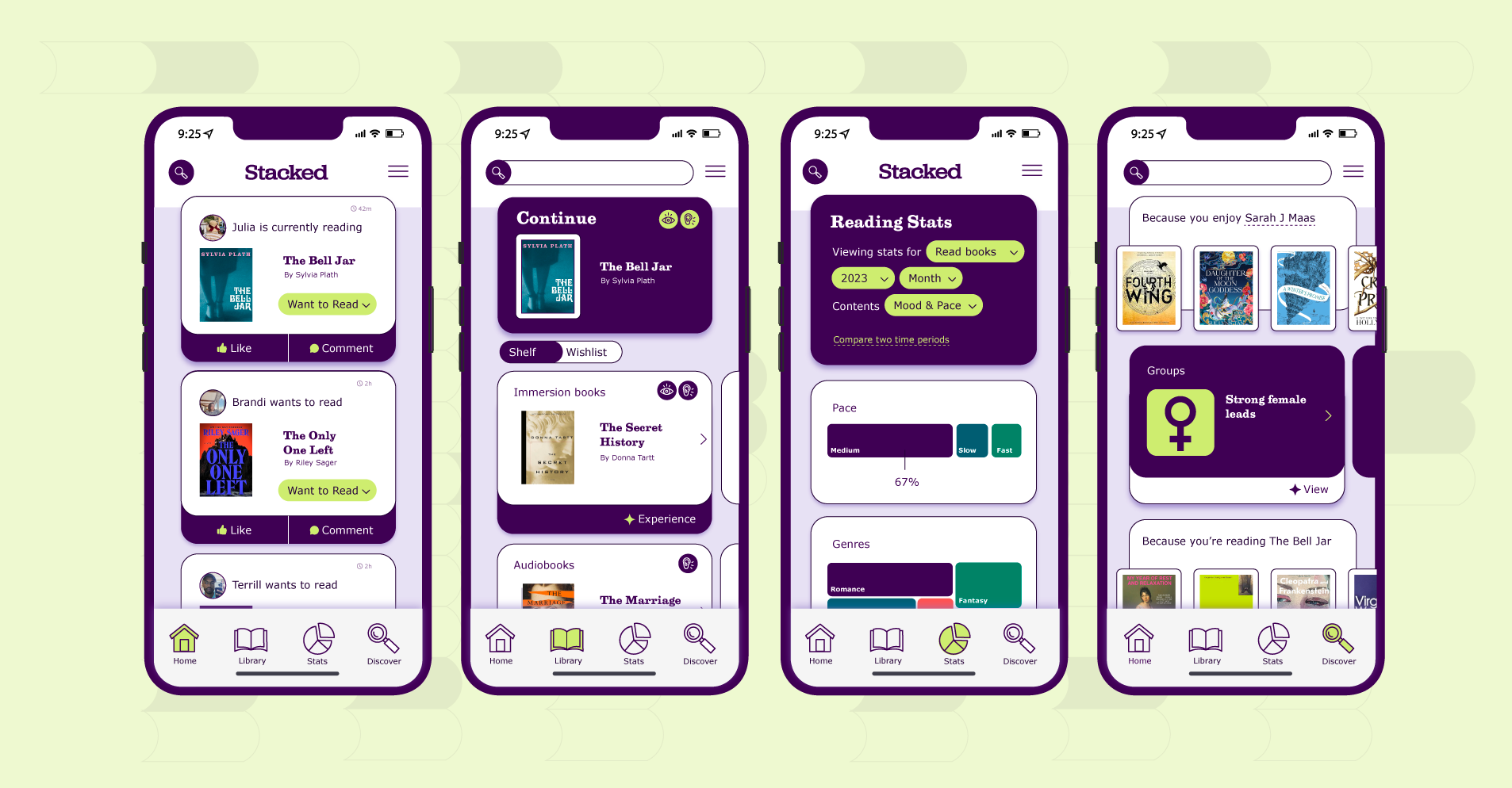
With Stacked, my aim is to revolutionize the reading experience by crafting a user-centric platform. Stacked will seamlessly integrate easy social interaction, vibrant communities, insightful statistics, and a unique in-app immersion reading feature. Users will also have the flexibility to choose between enjoying books as immersion, audio or ebooks as they prefer.
Accessibility is at the forefront of Stacked, exemplified by the inclusion of features like immersion reading. Immersion reading involves simultaneously reading a text while listening to the same content, catering to a diverse audience. It proves especially beneficial for individuals learning a foreign language, those who are neurodivergent, and those looking to devour an entire series in a week.
Central to the essence of this app is the concept of connection. Readers yearn for meaningful conversations with like-minded individuals. Imagine uncovering the biggest plot twist in your current cozy mystery; Stacked provides you with the perfect space to share your thoughts and engage with a community of fellow readers.
I aimed to design UI components that evoke a tactile feel, reminiscent of the stacked tower of books in my living room. Taking inspiration directly from physical books, the form naturally aligns with various UI elements, adding a touch of authenticity to the user interface.
Selecting a serif font conveys the welcoming and connected atmosphere I envision for users on the app. Opting for a slab serif adds a whimsical touch to the traditional serif, infusing a sense of playfulness. Utilizing a sans-serif font for H3, H4, and H5 underscores the app's commitment to accessibility and its modern essence.
The choice of fairy-tale-like, bright, and vibrant colors for the product was intentional, harmonizing well with the app's target audience and complementing the enchanting illustrations I crafted. When conceptualizing the logo, my goal was to capture a sense of stacking without feeling cramped—allowing room for users to 'make space for another book' in their virtual collection.


